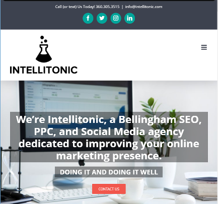
We know our strengths and we know our weaknesses. Although designing is not our strength, we do have an eye for it. We interviewed a number of local designers, all of whom would have done a stellar job. But in the end, we chose HubBub Agency for their passion, creative ideas, willingness to dive into our brand, ask questions, rip it apart, and mold it into something that reflected who we’ve become – not who we were when we started.
Our old site was good. Well, it was acceptable. But we wanted great. We wanted to attract more mature companies by showing that we’re successful ourselves, that we have the know-how, the budget, and the confidence to put a little rouge on and attract the right clients.
As we grew, time became more scarce as funds were made more available. But one thing has always remained: we’ve always been fans of keeping the main thing, the main thing. So we outsourced work we typically don’t do to an expert who does. We had a direction we wanted to go but needed someone else to make our vision into a reality. In came HubBub Agency.
The Website Rebrand Process

Tell Me What You Want, What you Really, Really Want
Before hiring HubBub, we dove through hundreds of other websites to find those we liked and capture what we liked about them. These were competitors, design firms, some of our personally most-visited websites, and really anything we liked. We created a shared Pinterest board and some Google docs with screenshots and explanations. Our team pow-wowed on what we liked, didn’t like, and why.
We also started editing our existing content with more sass, fewer words, and more clarity (we’re also big fans of the KISS method).
Finding “The One”
We started by putting our noses to the ground for local designers – there are some fabulous graphic designers in Bellingham. To be candid, everyone’s skills were so astounding, it was hard to pick. But after some interviews, HubBub was the one for us. They listened, weren’t afraid to push buttons, and went above and beyond.
The Design Process
We scoped out what we wanted, what the end goal would look like, and who would do what e.g. HubBub to design, Intellitonic to implement.
We had three design-iterations with HubBub:
Meeting 1: Explored the homepage, select service pages, our tagline, example stickers, and general website layout
Meeting 2: Reviewed HubBub’s edits based on our feedback and additional service pages
Meeting 3: Integrated the about page, the blog, final Ad Grants service page, and the whole she-bang on mobile
Rapping back and forth with HubBub was a dream. They brainstormed many, many different tag lines, icons, stickers, different design elements, and more. They reviewed our existing (and some in-progress) content and distilled it down even further. They reviewed how our content should be organized both from a user experience perspective and search engines. They gave us clarity and helped us to better speak to people outside of our industry; in other words, they helped us speak to potential new clients. They essentially held up the mirror to our business and put on the final polish.
Once we gave HubBub the big thumbs up, they delivered all files via PDF and Illustrator files.
Rebuilding the Website
Now, it was our turn to breathe life into the design. We created a separate development site to flesh out the new design while our stale one remained live. We sliced and diced images for upload, created templates via Elementor, and got to work importing content.
Once it was good to go, we set up redirects, made an annotation in Google Analytics, and made the site live. Then, we set up a meeting to review our Google Analytics month over month with the new brand (hint: great).
Consistency is Key
A new website required new materials including pop-up banners, business cards, stickers, and branded gear. HubBub lead the charge to some killer swag.
What We Learned
- Focusing on yourself can be hard.
- Finding the right partners is key – don’t be afraid to shop around.
- Good design looks easy.
It took a lot of elbow grease, but we finally pieced together a website we could be proud of. We couldn’t have done it without the visionaries from HubBub leading the way. That’s why we’re extending an invitation to everyone who would like a new face for their site. HubBub can help you build a new vision for your site while we organize and optimize it for the spotlight.
Do you need a rebrand? Let’s talk! We’d love to partner with you and HubBub Agency (or a designer of your choice) to deliver a new website that reflects your culture.
“Strong brands outperform weak brands by up to 20%… consistency is the secret ingredient” – McKinsey
