
A mobile-friendly website is more than an important part of your online strategy, it’s a necessity to business in 2020. According to BroadbandSearch.net, in 2019 more than 40% of website traffic was on mobile devices, and over 90% of internet users had access to the internet via mobile. In 2017, Google started rolling out “mobile-first” indexing, meaning they primarily use the mobile version of the webpage for ranking and indexing purposes. Now, in 2020, mobile-first indexing is the default. Mobile-friendly sites make it easier for customers to explore your products and services, and ultimately it creates a better user experience for everyone. As more and more people explore sites with their mobile devices, they will expect a clean, responsive version of your website. Without a responsive site, it’s safe to say you will likely have higher bounce rates and less conversions than on the desktop version of your website.
Choosing CMS: Mobile Website Design In Mind
Most popular web design platforms now have built-in mobile-friendly themes. If you build a website on Shopify, Squarespace, or Wix, the theme you use will probably be built with both desktop and mobile in mind. WordPress also has many themes that create a mobile-friendly website. If you’re looking for a new theme design, make sure to double check that it’s compatible with both mobile and tablet.
Super Mobile-Friendly: Elementor Page Builder For WordPress
When we build new WordPress websites or migrate an old website, we almost exclusively use Elementor for clients. (Our own website is built in Elementor as well.) Elementor is a complex page-building software. A page-builder can be used with a theme of your choice in WordPress as a way to create unique designs on each page, whether that be a page, post, or custom page type like an event or product page. Elementor is functional and easy to use. Its robust module library, excellent theme-building capabilities, realtime preview function and full revision history make it rival any other page-builder out there.
Elementor Responsive Preview Mode
A website that is perfectly designed for desktop may not look so perfect on a mobile device. The (much) smaller screen can make for unique issues, for example: extra white space, endless scrolling, images appearing too large, too much information on one page, or a button not reacting properly. With elementor, you can preview live changes to your website in mobile or tablet view as you edit in order to spot wonky issues.
To view a page you’re editing in mobile or tablet view, go to an elementor designed page and click the computer screen icon in the bottom left-hand corner. A screen will appear that allows you to preview for desktop (current view), tablet, and mobile.
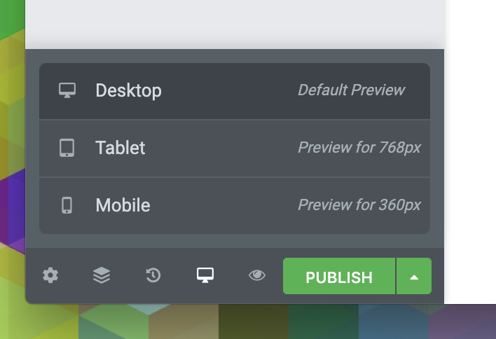
When you click on mobile you will see a mobile-friendly view appear.
How To Mobile Edit in Elementor
Many themes have mobile design rules built in that can only be changed by editing the code. With Elementor, there are many features you can change on your own. Popular edits include editing font size or hiding a widget. Note: if an element doesn’t have a Viewport Icon next to it, changing that element in one preview mode will change it across all devices.
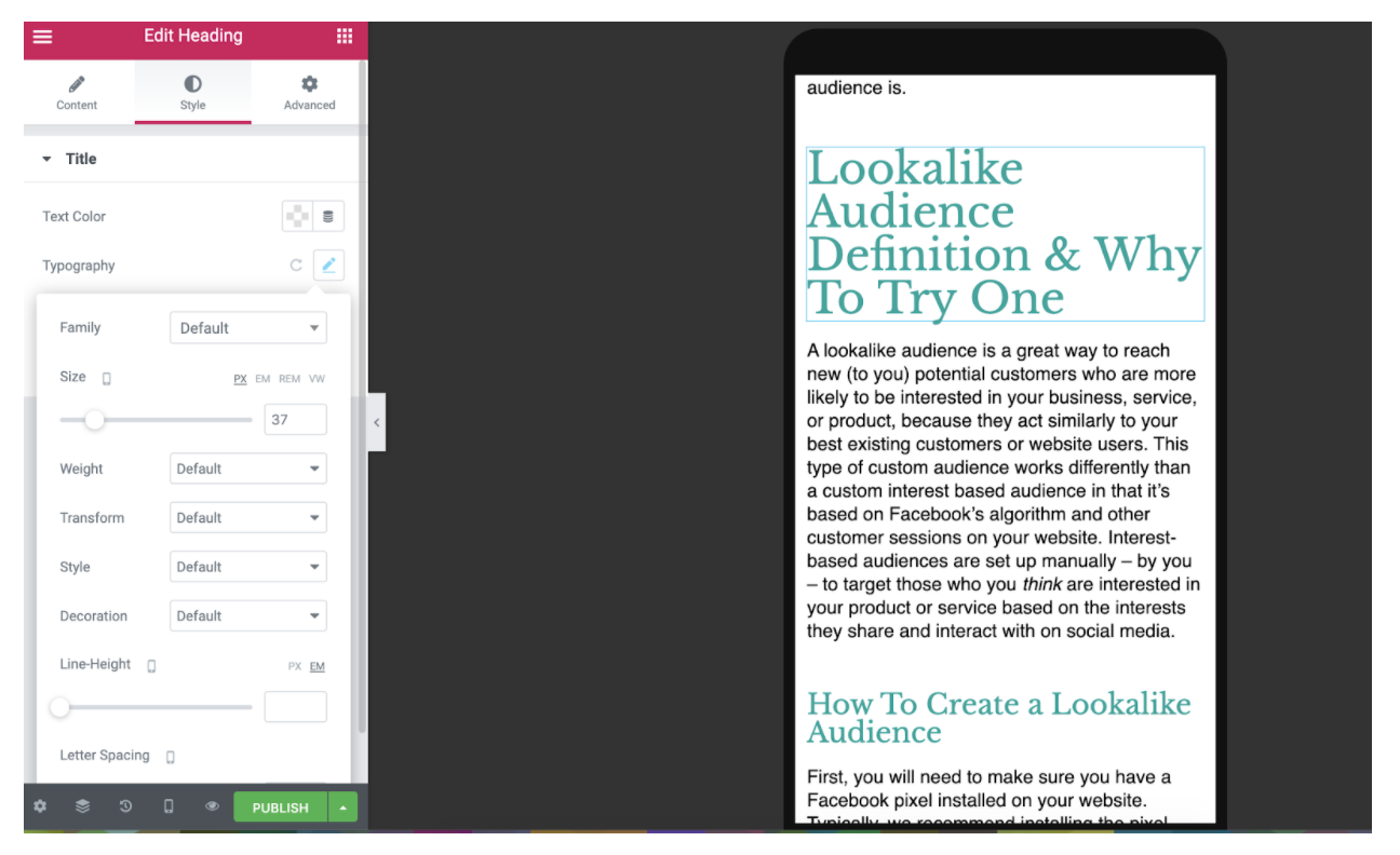
How to edit font size on mobile or tablet
Odd break in your title? Font too little to read on a phone? These are examples of times it would make sense to change your font style or size on mobile devices.
- Go to the text widget you wish to change
- Click “style” then “typography”
- Next to size, click the responsive icon and change to mobile or tablet
- Using the preview mode that activates, find a better point break in your title or change the font size or type.
- Press publish to save your work!
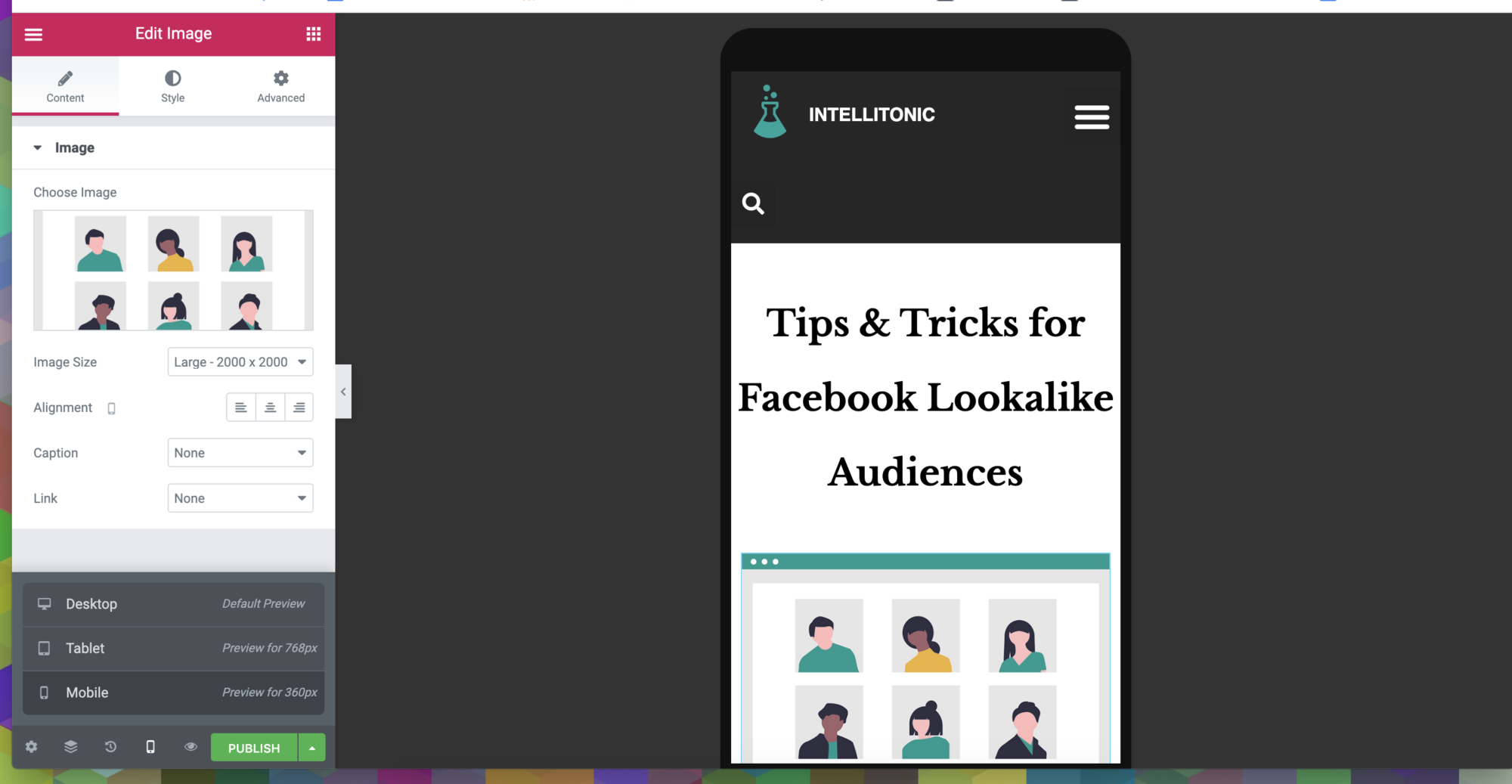
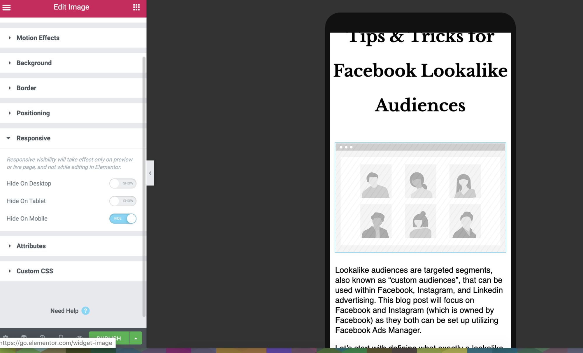
How to hide an image or widget on mobile or tablet
You may find that the perfect amount of images or graphics on your desktop webpage cause the users to scroll for too long to get the pertinent information on mobile. This is a good opportunity to hide some of those images.
- Go to the widget you wish to hide
- Click “Advanced” then “Responsive”
- Choose to hide the image on mobile or tablet (or both)
- Once hidden, it will appear greyed out on your screen
- Press Publish
Need more help? Elementor has a great online community forum that digs deep into specific questions on site design and troubleshooting issues, or email us at [email protected]. We’re happy to help!